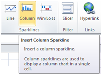
Most popular way to analyze data is by using charts in excel sheet however we have to keep data and chart in different sheet. To see data and chart we have to hop between sheets, Charts are objects which float on the row and column of sheet there are not a part of rows which make little difficult is someone really want to see the trend for each data rows. Sparklines is a tiny chart which can be placed in the cell itself hence data and charts can be viewed on same table or sheet. Creation of Sparklines is very similar to creating graph just by selecting column where we want place the Sparklines and have to select the range of data for which we want to see the Sparklines.and finally select the type of sparklines we want to see along with our data by selecting specific sparklines from sparkling column from ribbon menu. Following are some of example of sparklines (Images Courtesy MS excel product team).
By : Dharmesh Patel


Post a Comment